This is the story of how some simple design tweaks in one short-term rental delivered real ROI results. Scratch that—insane ROI results. It’s the story of how some inexpensive design changes led to a 45% increase in average nightly revenue.
Yes, I said that. 45%!
Even more unreal is it all happened with increasing short-term rental competition in the property’s neighborhood and in the city at large.
This case not only shows the relevance of interior design on the short-term rental business model, but it also illustrates how interior design trumps all else in the equation.
In other words, you can be a great host with great marketing and great processes – heck, maybe you are even a super host – but if you don’t have a well-designed property that stands out from your competition, your results will not be where they could be.
Not even close.
Take for example the case of Emily and Anthony Leonard, hosts of a 6-bedroom historic house in the beautiful Tower Grove South neighborhood of St. Louis, Missouri. The Leonards were doing everything right as Airbnb hosts – welcome treats, super-clean premises, record speed responses to guest issues – you name it, the Leonards were delivering.
Except of course in one thing.
Their house was ho-humming it in design pazazz. By that I mean, it wasn’t a badly designed house exactly, rather it was scoring a solid B- if design grades were assigned.
The Leonards contacted Karen and me because the competition was heating up in St. Louis. They were witnessing a worrying drop in both occupancy and rates and knew they needed to improve the look of the interiors in order to stand out from the competition.
After taking a look at their listing photos, Karen and I determined that with some minor design changes – we refer to them as “tweaks” – the Leonards could rock their ROI.
The Leonards contracted us for 15 hours of virtual interior design work to help them out. By ‘virtual’ I mean, we never set foot on the property; rather we work remotely by email, Facetime, text, and Google docs. We work this way regularly with our clients outside of Southern California.
Emily and Anthony were kind enough to allow us to write about their experience working with us so 1 Chic Retreat readers could learn about their amazing turnaround story, as well as get a feel for the way our design process works.
The Particulars:
Clients – Emily and Anthony Leonard
Neighborhood – Miami Street in St. Louis, Missouri
Goal – To augment average nightly revenue in their family-friendly 6-bedroom short-term rental house using interior design.
Time Frame – 6 months at the most, or before the birth of their third daughter, Edie. The couple knew it would be next to impossible to make changes with a newborn baby.
Budget – Initially $3,500 but we persuaded them to double that amount, plus add some cushion, in order to get the kind of results they wished for.
Designer Strategy – Karen and I determined that because the budget was small, we would concentrate on the rooms that most impact bookings – the living room, foyer, and master bedroom. Normally, the dining room is a huge factor, but we loved their current dining room and didn’t think it needed any changes.
We told Emily and Anthony to improve the other bedrooms down the road, as revenue improved, a method we advise frequently to clients with a limited budget.
Our Design Process
CONCEPT
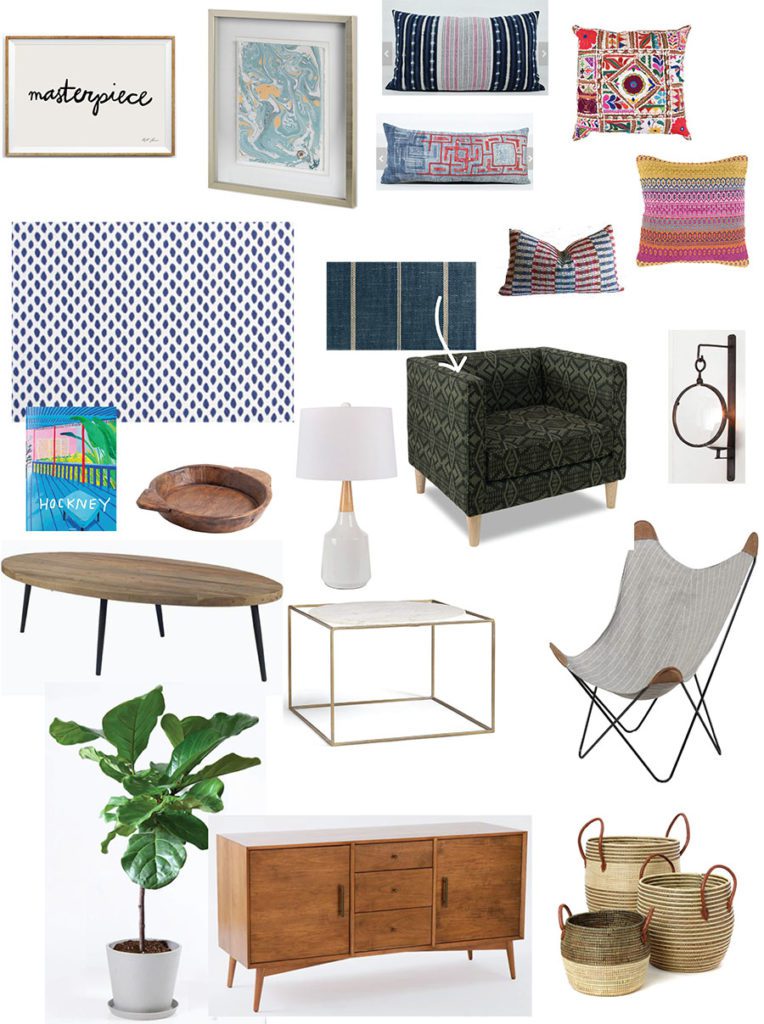
The first thing with which we always start is the design concept. If you don’t know what that is, please read this article. In summary, a design concept is an image board that represents the general design direction of the project. Think of it as an aesthetic business plan – once it’s set in motion, it serves as an overall style guide to everything you plan and purchase.
In sum, it gives aesthetic cohesion to all inside and outside areas.
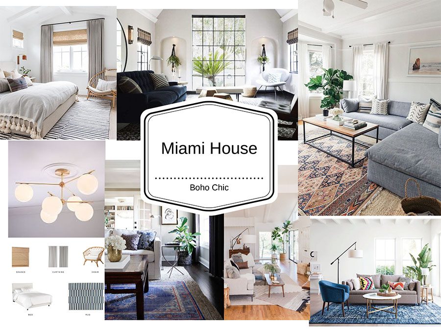
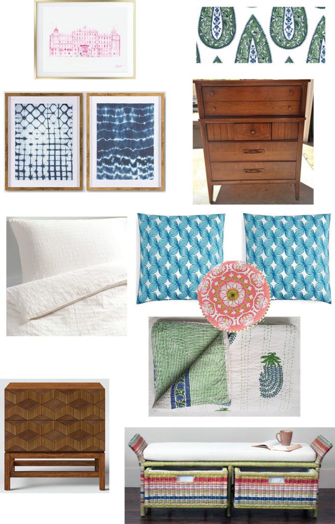
Because the house was family-friendly, Emily wanted a casual, laid-back vibe in the rooms. “Nothing formal or stuffy,” she emphasized. She also sent us some images of rooms that represented her style, most in the ‘Boho Chic’ aesthetic. The look is very versatile for many types of short-term rentals because it appeals to a wide variety of people and agrees with most architectural styles.
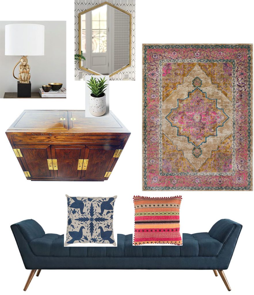
We created this imageboard illustrating Emily and Anthony’s design concept. It will guide all buying decisions or work done moving forward.
PAINT
We immediately implored Emily and Anthony to paint the target rooms a lighter color. Beige walls make it really hard to pop the furnishings. Earth tones are always an uphill battle and they were dominating big time throughout the house. Read this article on why we hate earth-toned interiors.
We suggested Decorator White by Benjamin Moore, or similar.

The Leonards agreed to paint the downstairs rooms, which included the foyer and living room, but decided to wait on the master bedroom to stretch the budget.
Instead of Decorator White, the Leonards opted for “Colonnade Gray’ by Sherwin Williams. While not our first choice, it still did a great job brightening the rooms and giving them a crisper appearance.
Problem solved!
ROOM BY ROOM DESIGN
When we design for clients, we usually proceed room by room, either presenting one room at a time or alternatively, presenting all the room schemes at once. It all depends on how our clients wish to work.
In Emily and Anthony’s case, they wanted a more systematic approach whereby they could concentrate on one room at a time.
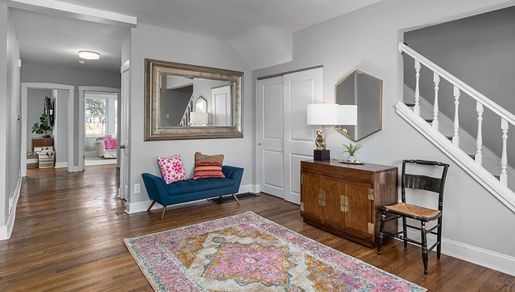
FOYER
We decided to start with the foyer, as it’s the first impactful space guests encounter when entering a house for the first time; it foreshadows what follows. First impressions matter in vacation homes and Airbnbs.
Before:
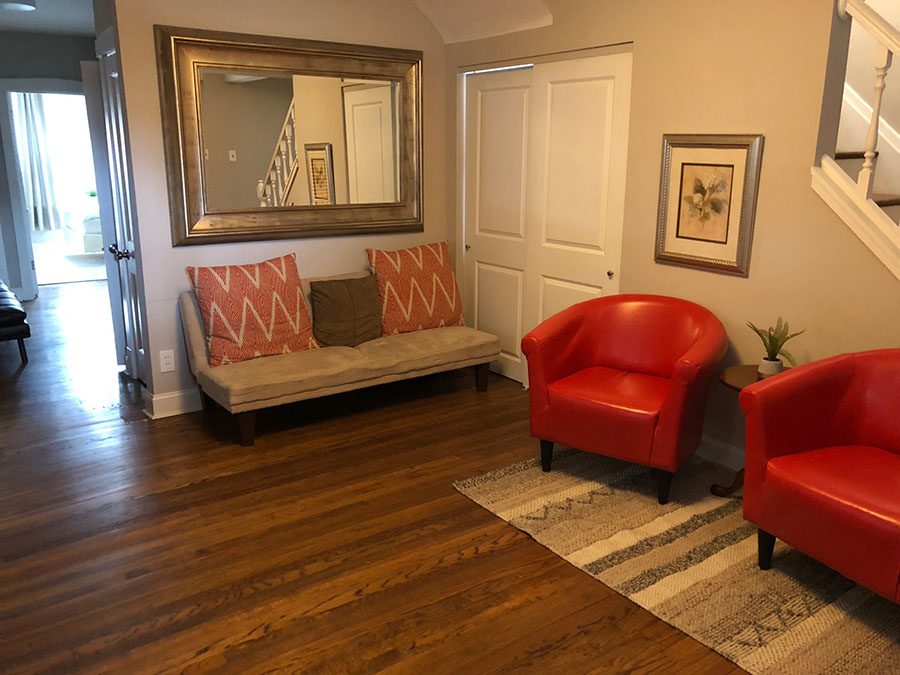
Foyer problems:
- The rug was way too small and earth tone dominant. We stay away from any earth-toned rugs when they go over wood. Earth tones on top of earth tones equal BLAH. Furthermore, the rug was way too small and consequently did not define the foyer square footage. Rugs are like maps, they define areas with boundaries.
- The red chairs aren’t’ serving a purpose (who sits and talks in a foyer?) nor does their style go with the concept.
- Bad art.
- The bench under the mirror was too big and was blocking the closet door.
- The foyer lacked both a table lamp and a surface on which to place keys, phones, etc. Every foyer needs a table or chest with a table lamp.
Foyer Fixes:
- Paint the walls a lighter shade.
- Put a smaller and less deep bench under the mirror. We selected a backless one and specified two bright pillows to go on top.
- Replace the red chairs with a vintage cabinet and one small leggy chair. Guests appreciate a cabinet because they put stuff on top of it – keys, sunglasses, etc. And one chair is nice in case a guest needs to set a handbag down or put on their shoes.
- Put a table lamp on top of the cabinet to give off a soft light when the overhead light isn’t on (nice at night when guests are settling down for the evening or coming in after a late night).
- Replace bad art with a large mirror. Guests like to check themselves out after all. ;0
- Replace the small earth-toned rug with a larger, brighter one. The rug we specified is actually an indoor-outdoor rug, able to withstand rolling suitcases and dirty shoes.
- Put some greenery in the room. We specified a small faux succulent to sit beside the table lamp.
FOYER SCHEME
After:
The Leonards were over the moon after the foyer reveal. The entrance is much more functional for guest needs, the brighter, lighter paint wakes it up, and the larger rug helps define the space.
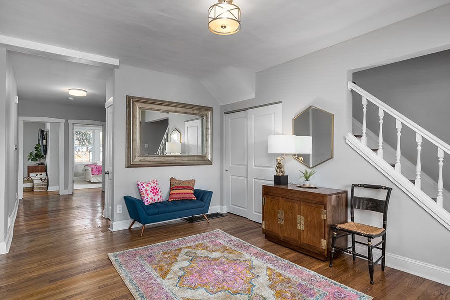
Things to do down the road:
- Replace the large mirror above the blue bench with one more in keeping with the concept.
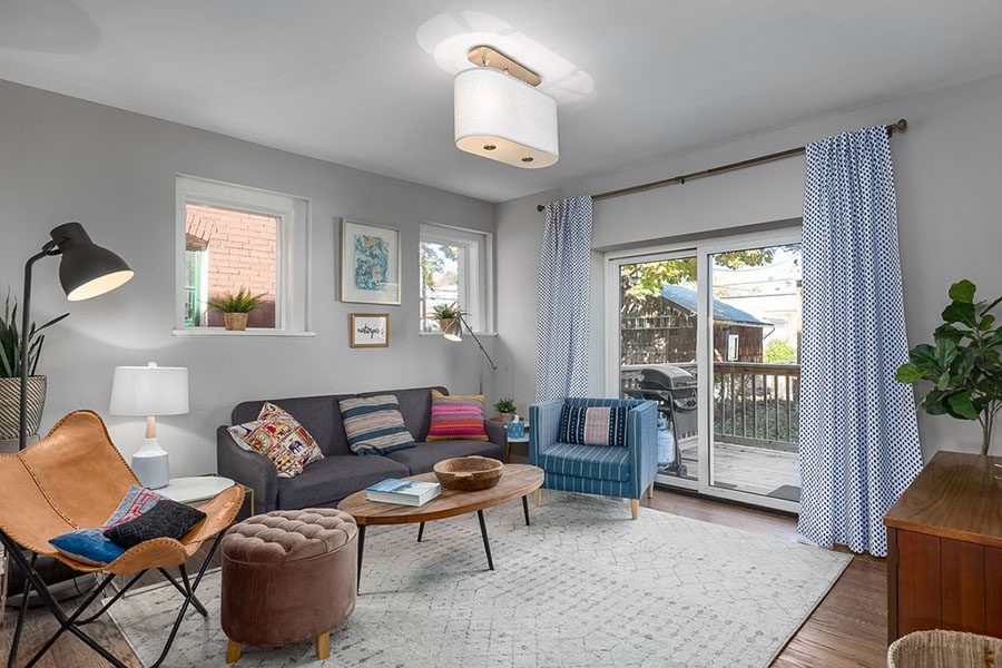
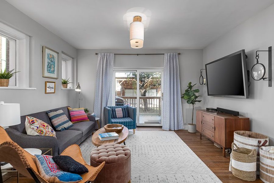
LIVING ROOM
The living and dining rooms are what we refer to as the “bread and butter” rooms of the short-term rental. In other words, the impact these spaces have on guest happiness and in turn, reviews and occupancy is gigantic.
These are the areas in which guests hang out and gather. Fail here and you will fail everywhere.
The Leonard’s living room was where we spent the majority of our design hours, as it needed the most help. The dining room was already beautifully designed, so we left it alone.
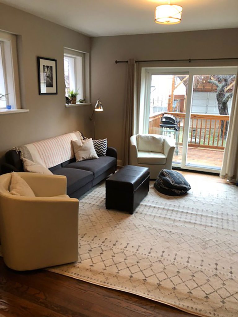
Before:
The living room’s problems:
- The two bucket chairs on either side of the sofa were not in concept and looked like they came from a furniture sale warehouse (in other words nothing special).
- The leather cube acting as a coffee table was ugly and worn.
- Art looked stock and not custom; plus the dark frame was overbearing.
- Curtains were a boring beige and did nothing to enhance the design of the room.
- Pillows looked cheap and slightly worn.
- The media cabinet was an unattractive dark wood and looked ‘furniture warehouse-ish.’
- Open shelves used to store toys and games were cluttered looking and the dark wood looked ‘furniture warehouse-ish.’
- The sofa was from Wayfair and cheaply made (we never recommend Wayfair seating of any kind because it won’t last); however, the style was ok and we decided, due to the limited budget, that the Leonards should keep it for the time being and plan to replace it as revenue increased.
Living Room Fixes:
- Replace bucket chairs with two different kinds – one an armchair with a denim grade fabric and the other a leather butterfly chair. Two mismatched chairs would give the room a more “curated” feeling rather than the previous ‘matchy-matchy’ look.
- Replace curtains with soft, blue-patterned ones and raise the curtain rod up by 12″ to make the ceiling look higher (one of our signature tricks). Curtains can really enhance the design pizzazz of a room so never buy boring beige ones. It’s a lost opportunity for a wow factor.
- Replace the coffee table with a leggy one. Leggy furniture makes a room look bigger.
- Put a large marble side table beside the not-wide-enough-sofa to add visual length to that side of the room. Furthermore, guests like substantial side tables for placing drinks. Marble is a good durable material for any surface on which people put drinks. No ring marks to worry about.
- Put bright, “boho-ish” pillows on the sofa and armchairs.
- Replace art with more whimsical and unique prints in light-colored frames.
- Replace ugly dark media cabinet with a vintage, mid-century modern one and get rid of shelves entirely.
- Where open shelving was, replace with candle sconces (with battery-operated faux candles).
- For toy storage, supply a trio of deep wicker baskets.
- Place a faux fiddle leaf fig in a corner to add greenery (because every room should have a touch of greenery).
LIVING ROOM SCHEME
After:
All agreed that the living room’s makeover was a vast improvement. Goodbye earth tones, boring pillows, and furniture warehouse!
Things to do down the road:
- Replace low-quality sofa with something built to last.
- Replace dark floor lamp hovering over the leather chair as it does not go with the concept.
- Replace brown ottoman with something more in keeping with the concept.
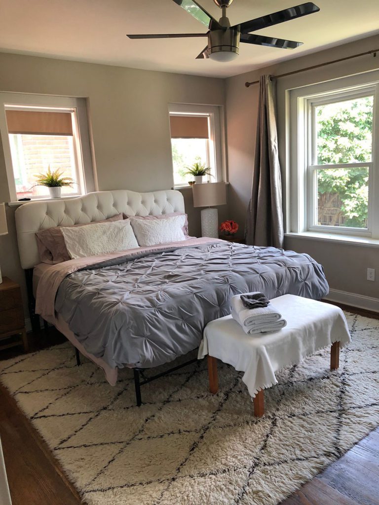
MASTER BEDROOM
The master bedroom is another bread and butter space because when people look at your listing, they will specifically look at bedrooms, particularly a nicely designed and comfortable master bedroom.
Ideally, all the bedrooms should be equally appealing because everyone will want an appealing bedroom, but Emily and Anthony’s budget was limited so we decided to just concentrate on the master for now, and improve the other bedrooms as revenue increased.
Before:
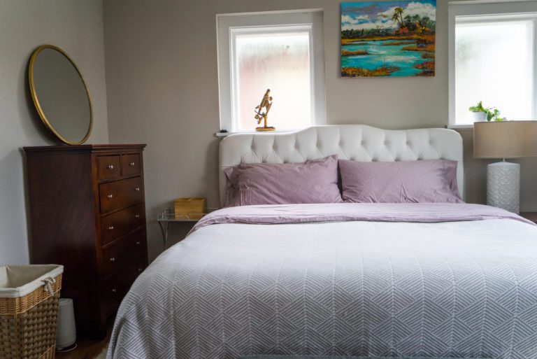
The master bedroom’s problems:
- The bedding did not look professional. Sheets were not white, and duvet looked tired.
- Art behind the bed was too large, not in concept, and hung too high.
- Bench at the bottom of the bed looked like a table instead of a bench.
- Curtains were beige and dragged the entire room down into “blah-ness.”
- Nightstands were too small and low for a king bed.
- There was only one bedside lamp and beds always needs two.
- The dresser next to the nightstand was “furniture warehouse-ish” and needed to be replaced by something vintage. Furthermore, it was placed awkwardly next to one nightstand and needed to be moved to the wall facing the bed.
MASTER BEDROOM SCHEME
After:
New, larger-scaled nightstands, white bedding, a wow-factor bench, decorative bed pillows in keeping with the concept, and the Indian, block-printed curtains raised the bar WAY up in the sky in the master.
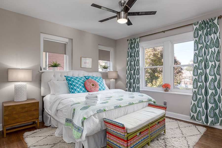
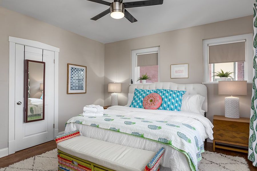
Things to do down the road:
- Paint the walls the same color as the living/dining rooms and foyer, to give it a crisper look (the beige wall color is blah). This is the only factor still working against the room.
Total Tweak Cost – $8,281
Here’s the breakdown of the design:
- Design fee $2,250
- Living room: $2,656
- Foyer: $1,320
- Master: $1,705
- Paint – $350
Although the total cost went over the initial goal of $7,000 by 15%, the Leonards both agreed that the investment has more than paid off. They are doing insanely well.
The Results!
Why should we say it when Emily and Anthony say it best? We received this email last month and we think it sums it up the results perfectly….
Hi ladies! We’ve finally had a chance to go through some numbers for you on the Miami house. We’ve been super busy this spring with the new baby (and her sisters!) and Anthony has been gone a lot interviewing for oculoplastics fellowships as he’s done with residency here next June. Anthony is a big data guy so I got him to run some numbers for us. It looks great!
Our seasonal quarterly gross revenues increased 37.7% (Q2 2019 v. 2018) following our redesign with 1 Chic Retreat. This is compared to essentially flat revenue change (-3%) over a similar time period (Q3 2018 v. 2017) before the design work. The most recent months of May and June look even more encouraging with a 45% increase from $312 to $450 average nightly revenue year over year.
We were initially motivated to reach out to you because competition in our market had exponentially increased – which actually led to a decline in revenue in Q3 and Q4 2018. We determined that we needed to stand out amongst our competitors. It quickly became apparent after posting our updated photos with the design changes on the listing that guests were receptive to the redesign! We are big believers that guests love aesthetics. And now for some updated baby pics.. Edie is 6 months already! -Emily