Last month my husband and I had the good fortune of spending a few nights in the newly opened Maison de la Luz in New Orleans, the smaller, more luxurious boutique hotel (or guesthouse as they refer to it) cousin of the neighboring Ace Hotel.
I love staying in boutique hotels because they are literally an on-site lab of what goes into providing a truly top-notch and singular hospitality experience. What applies to hotels also applies to Airbnbs and short-term rentals.
Hospitality is the business model after all.
As the lab rat, so to speak, I deconstruct the components going into the overall experience – the why’s of why it feels so good to stay in them – and share them with you so we all learn something.
After all, incorporating even some of these elements into your own vacation homes and short-term rentals has the potential to not only increase guest happiness levels, but also bookings, rates, and awesome reviews.
(Note: most images were taken by me but I also used some of Maison de la Luz’s instagram shots, as well as a few from AD to better your viewing experience).
Breaking Down the ‘Wow’s’ of the Maison de la Luz
1. Location
Aside from the enchanting design, we were attracted to the Maison de la Luz’s location. It sits in the newly reinvented Central Business District, or CBD as the locals call it, which is conveniently located between Uptown and the French Quarter. Similar to many American urban centers, the New Orleans’ Central Business District was once a crumbling ghost town after work, but not anymore! Evenings now bring people out to free concerts in Lafayette Square, numerous restaurants and bars, design venues, and theaters. It’s not quite as rowdy and touristy as the French Quarter, nor as quiet as Uptown, being a nice, happy medium between the two.
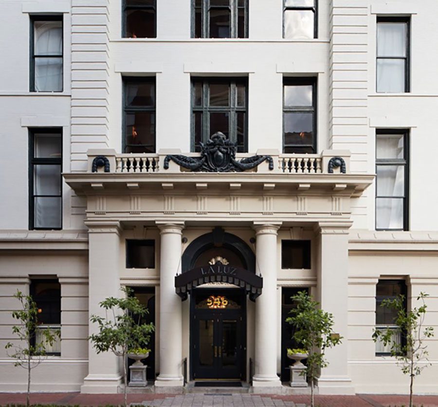
Here’s what the Maison de la Luz looks like from the street – utterly stunning and yet understated at the same time. It occupies a 1908 six-story building that used to be a city hall annex.While the next door Ace Hotel has a definite “see-and-be-seen” vibe, Maison de la Luz bills itself as a “a refuge,” according to its press release. The building’s front is painted in a putty with black accents, giving it an under-the-radar luxuriousness one can’t help noticing upon arrival. Image via Instagram
2. Design Concept and Narrative
Studio Shamshiri, the LA design firm behind Maison de la Luz, infused a layered design narrative throughout the property. Pamela Shamshiri has a background in movie and music-event production, and storyboarded the design concept during the 24 month renovation of the building.
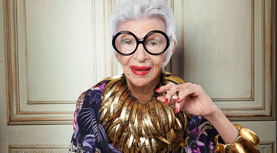
According to the Wall Street Journal, the creative team imagined a layered, rich, and multicultural look for the 67-room guesthouse, an eccentric cousin to the hotel Atelier Ace hotel family. Shamshiri’s role model was Iris Apfel, the New York–based nonagenarian style icon. “I imagined Iris being from New Orleans—that she’d moved away to travel the world and come back to open up this place.”
Shamshiri’s concept incorporates much of what New Orleans is all about – its Caribbean culture, African heritage, as well as southern influences. The building’s architecture was also accounted for -a decidedly French Art Deco vibe overrides throughout.
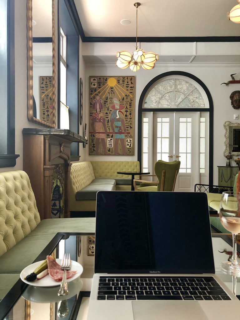
Walking into the private lounge and conservatory-style breakfast room upon check-in, I personally felt as if I were walking into a Matisse still life painting. And honestly, I CAN imagine Iris Apfel enjoying a glass of champagne over there in the corner.
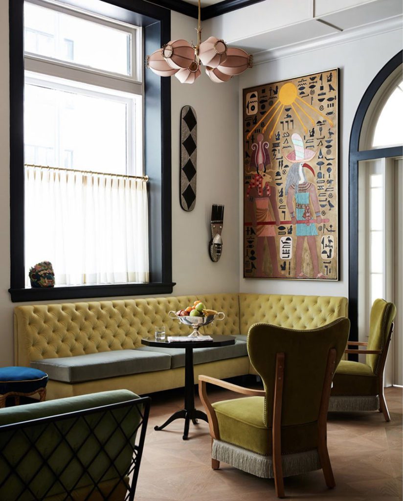
The narrative design concept of the guesthouse is literally spelled out in the website’s ‘about’ page,
“A place for reverie and proper Southern swoon, for prophetic visions or quiet inspiration, Maison de la Luz finds beauty in the curious and defines luxury as moving through the world with grace.”
3. Color
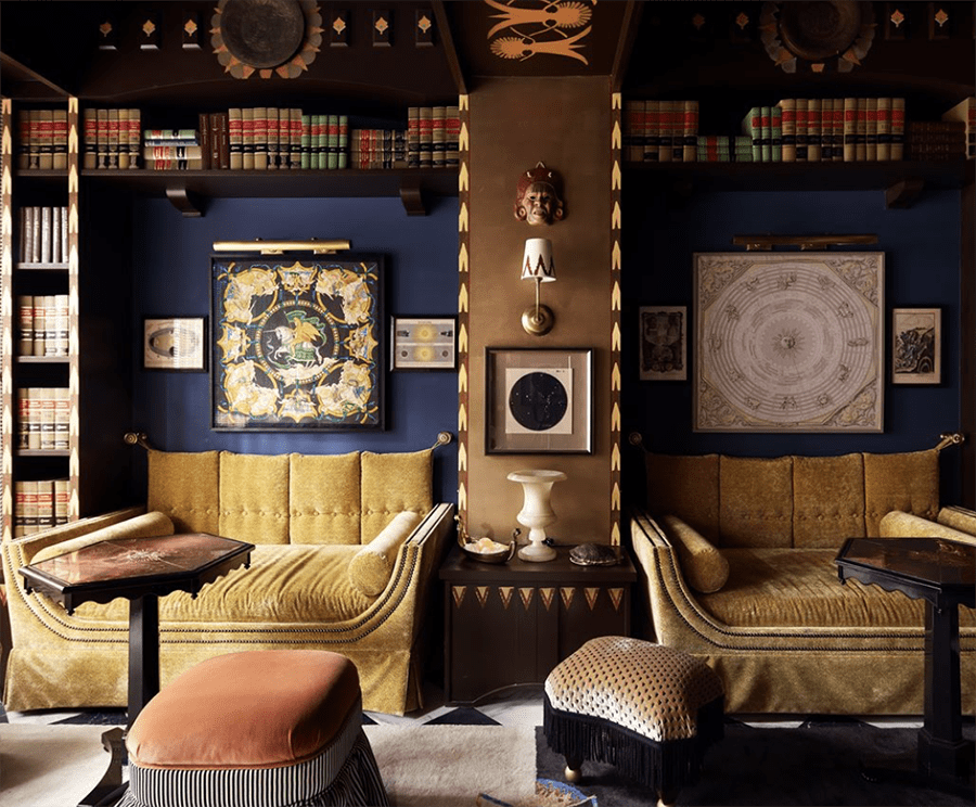
The juxtaposition in color between the public spaces – lobby and bar are a feast of jewel tones – and the private spaces – guest suites are muted and understated – highly contrast, and yet, it makes sense. After all, in public spaces, people are active and crave a brighter, more stimulatory environment and therefore appreciate and respond to bright colors; in private, on the other hand, people want to relax and thus enjoy a more muted color palette.
First the private….
We were over the moon just walking into our room after an ungodly early flight from LA. The space was brimming with soft muted colors and soft lighting. I was particularly intrigued by the wall color, which appeared to be a very gender neutral pink. The result was a very romantic feel without an ounce of “girliness” that’s usually associated with the color.
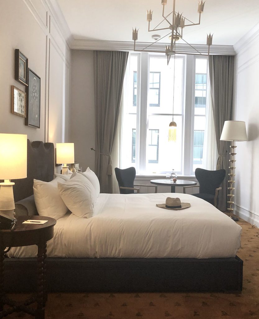
For a similar wall color, try Farrow and Ball’s ‘Great White’, described on F&B’s website as “an elegant white not named after a shark, but simply refers to how wonderful the colour is! Great White appears to be a very pale lilac when contrasted with our All White. Despite its red undertone, it is not the warmest of pinks. The inclusion of the merest amount of black lifts it to a wonderfully sophisticated shade with an extraordinary depth of colour.”
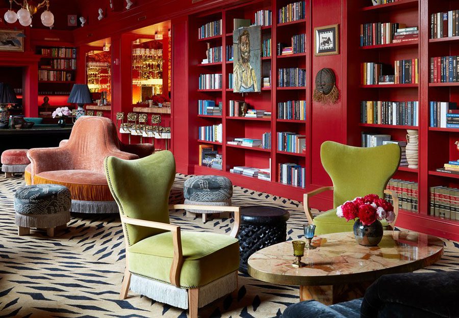
Now contrast those muted tones with the salon, a virtual riot of jewel tones all marrying together like a 60’s commune….
Or the wild red and zebra tones of the hotel’s bar, The Bar Marilou…
4. Dreamy Mattress, Pillows, Sheets, and Towels
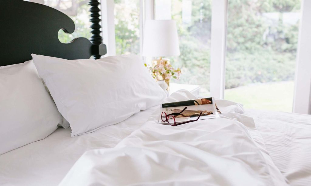
It’s a comforting feeling, walking in and seeing a white, glowing bedscape before you. The sheets were sublimely soft and the mattress was like sleeping on a cloud.
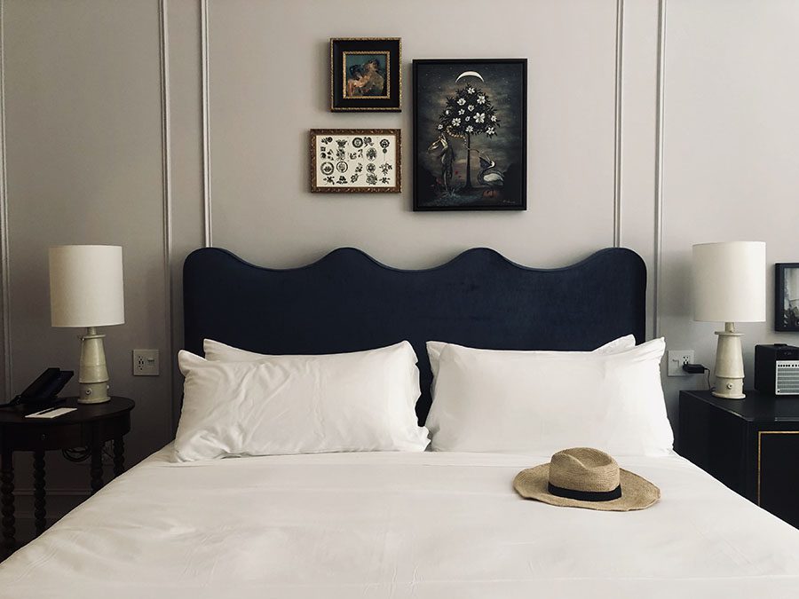
For similarly soft sheets (without a big price tag attached), try Bellini linens for dreamy hospitality grade sheets along with our custom mattress…
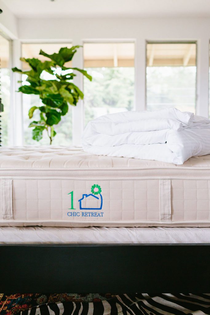
And there’s nothing like some perfectly folded, fluffy, white towels in the bathroom to greet you.
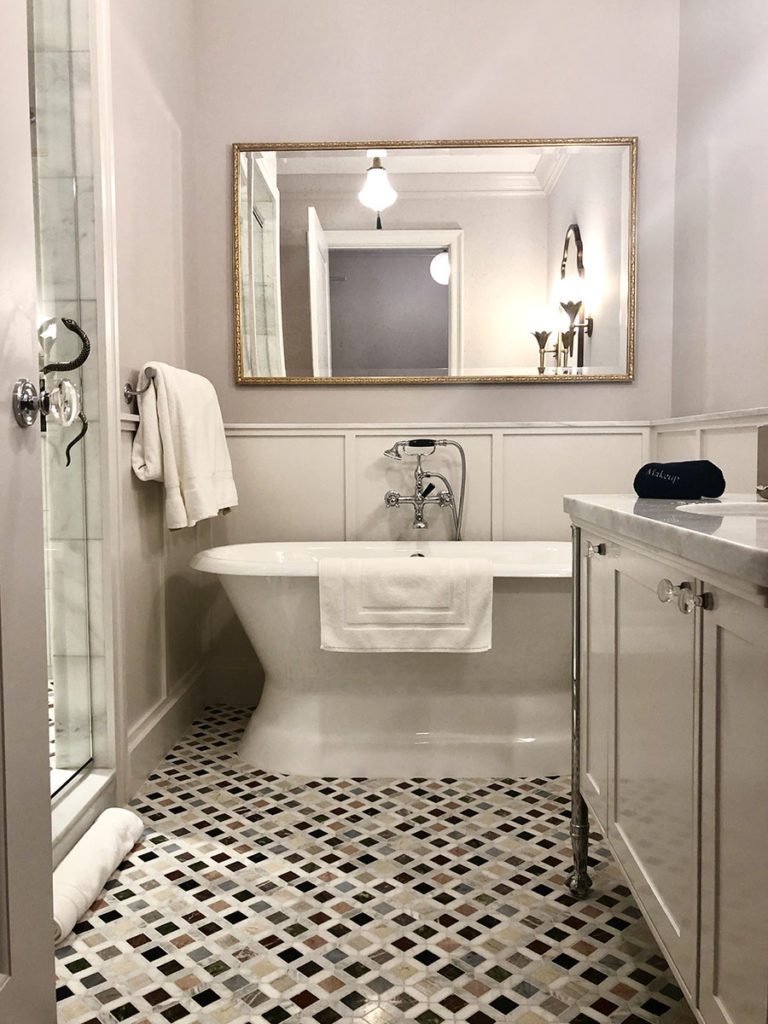
After the hot shower, all that was left was slipping into soft, hotel-issued robe and slipping between the bedsheets, and calling room service.
5. Welcoming Touches Galore
Let’s be frank – to be welcomed with open arms is enchanting, and Maison de la Luz, delivers in spades.
First, there was the coffee and tea all ready for us in the lobby upon check-in…
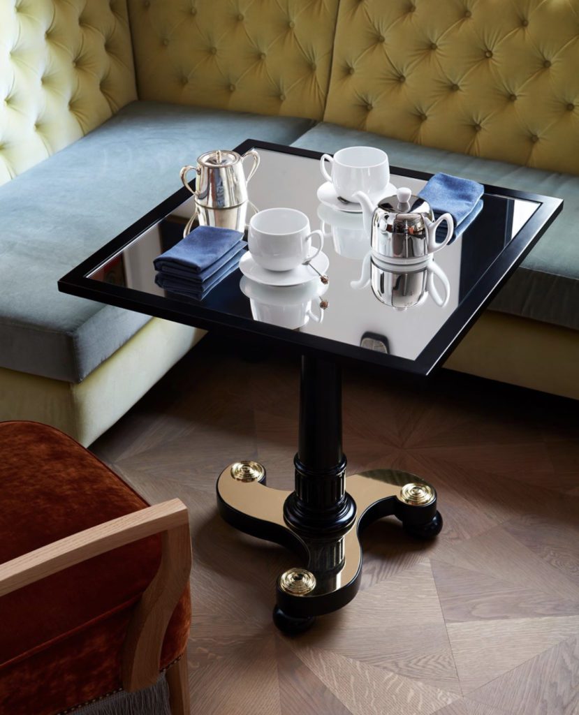
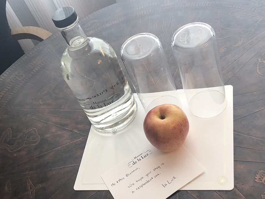
Followed by a freshwater bottle, two glasses, and a handwritten note, sitting upon the table near the window in our guest suite….
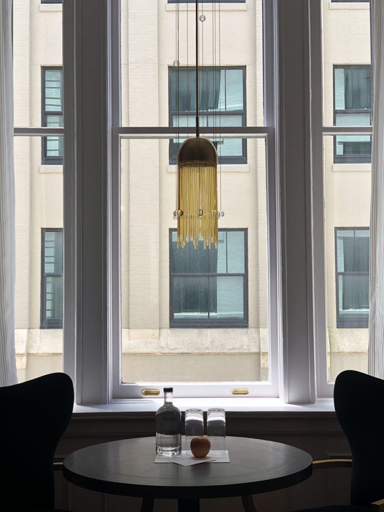
that personally greeted us my name. Wow! It’s not terribly hard to do, but boy does it go a long way in making people feel special.
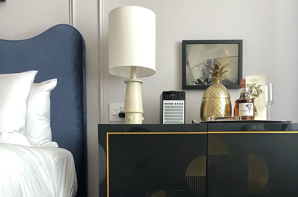
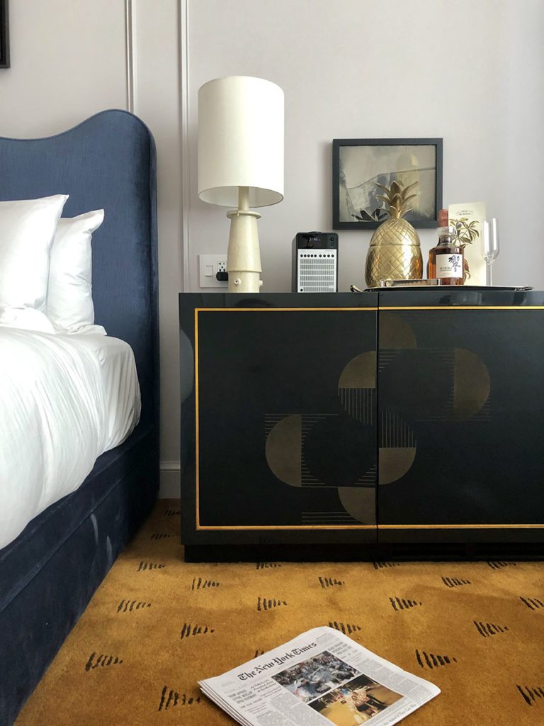
One unique characteristic of the room was seeing a bar cabinet serve as one of the room’s nightstands. Sitting handsomely upon it were some alcoholic treats, which not technically welcome goodies because you had to pay for them, still were appreciated as an enticing possibility should the mood strike us.
6. Curated, Unique Art and Accessories
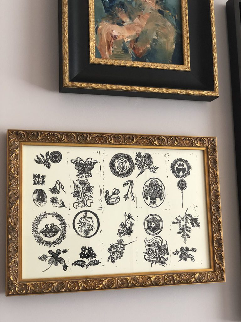
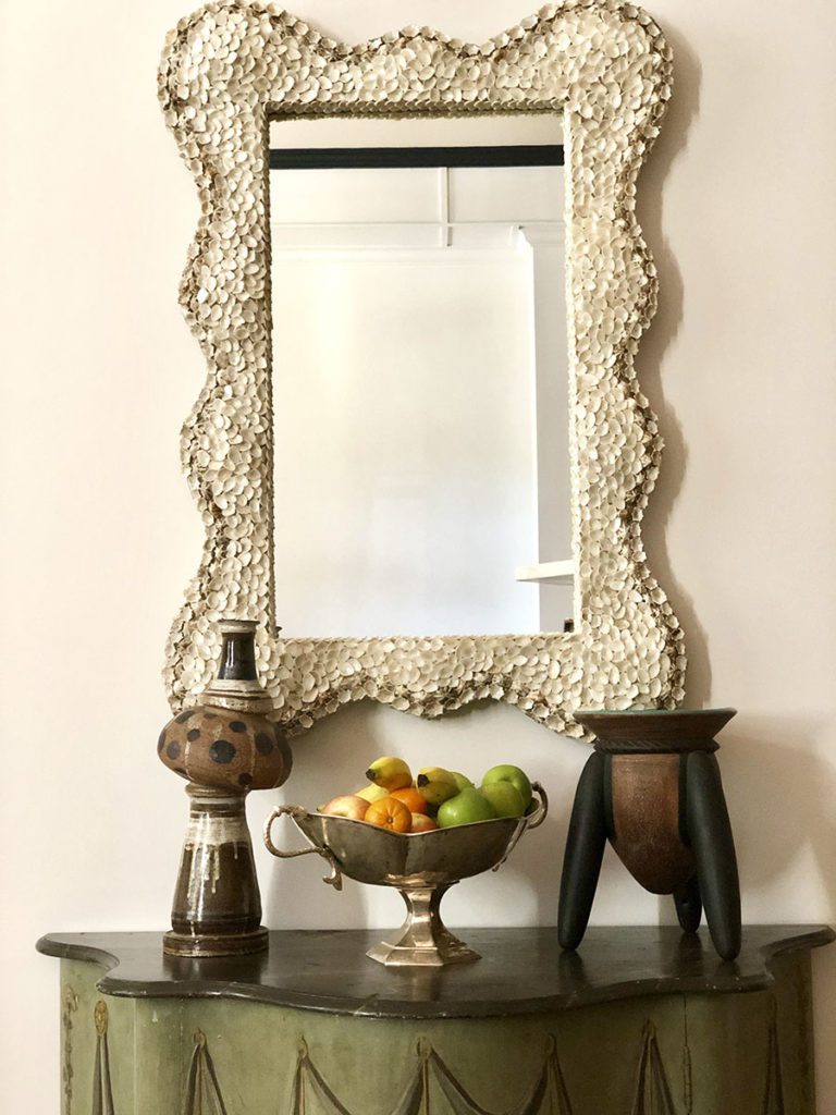
Last, but absolutely not least, were the unique accessories and art pieces found throughout the Maison de la Luz. As vacation home designers, we always specify unique objects in all our projects. Why? Because they make a property inimitable and singular; they add a signature look to your brand. It means no one can copy you.
These are just some of the unusual items I paid attention to:
In Case You Want to Infuse some Maison de la Luz Vibe into Your Own Vacation Home…
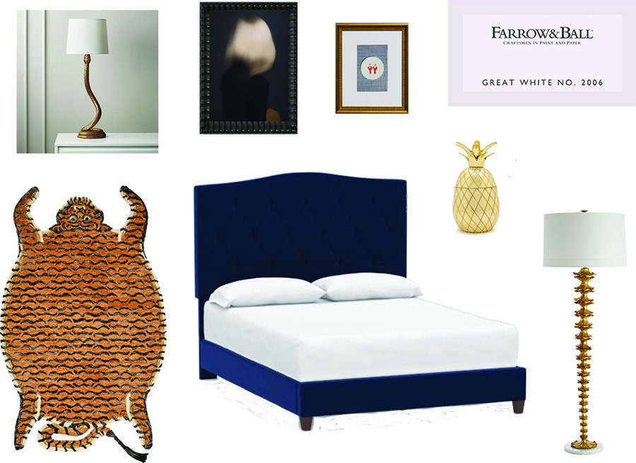
So dreamy, right? Now that we’ve deconstructed the Maison de la Luz experience and have figured out at least a little of why it’s so amazing, why not infuse a little of its verve into your own vacation homes?

