Now that we have already talked about the trends for 2024, we cannot forget to discuss the buzz around Pantone’s Annual Color of the Year. Annually, the world awaits the announcement, and even though it seems like it’s affecting a tiny sliver of our lives, it’s something to pay attention to. Ever since we’ve been in design, we are always a bit baffled about WHY they chose what they did and rarely thinking about it beyond a quick glance. BUT like most things baffling, it’s fun to study something, especially when so much research goes into it. So we did a deeper dive this year.
So here’s the skinny:
Pantone states that ‘to arrive at the selection each year, their team of global color experts at the Pantone Color Institute comb the world looking for new color influences. This can include the entertainment industry and films in production, traveling art collections and new artists, fashion, all areas of design, aspirational travel destinations, new lifestyles, playstyles, or enjoyable escapes, as well as socio-economic conditions. Influences may also stem from new technologies, materials, textures, and effects that impact color, relevant social media platforms, and even upcoming sporting events that capture worldwide attention.’
Pantone goes on to say that ‘anything and everything taking place in our culture during the year can influence our Pantone Color of the Year selections, with each source carrying a different weight from year to year depending on what’s taking place in our culture at that time. For example, if you look back to 15 years ago, technology would have played an infinitesimal role. Today that is no longer the case. Gaming, social media, augmented and virtual reality, and physical design itself are all influenced by our technology and the colors we can access in the digital environment.’
Here’s our own take on the color of the year – by itself, it does not make sense, right? I mean a square of color rarely feels especially impactful. In fact, we are sure that most folks, if they bother to look at it, shrug their shoulders and keep scrolling. However, you have to think of the color WITH other colors, how it’s combined; also how it’s lightened up or darkened down affects how it’s felt. We don’t think most designers keenly await the announcement and then get to work on using the color all over the place that year; that would be weird to be honest. However, when you take in the color, see why it was chosen, you WILL uncannily see it everywhere, and you might just think about incorporating it into your life. So bravo, Pantone for making us a little more intellectual.
So now that we understand a little more about the color of the year, let’s look at this year’s (ta da!) – Peach Fuzz.
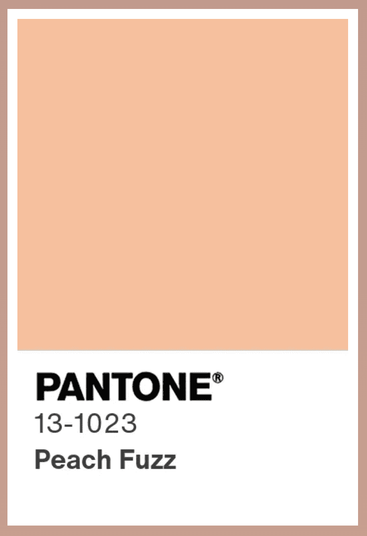
Why was this particular color chosen? The Pantone website states that “In seeking a hue that echoes our innate yearning for closeness and connection, we chose a color radiant with warmth and modern elegance. A shade that resonates with compassion, offers a tactile embrace, and effortlessly bridges the youthful with the timeless,” says Leatrice Eiseman, Executive Director, of the Pantone Color Institute™
We can certainly get behind that sentiment! We aren’t the only ones – we are seeing the color everywhere! In fact, we were spotting it even before we knew it was a thing. More than anything, we see it combined with other colors, making it all the more impactful. The Hotel Bardo, just around the corner from where I (Mercedes) live, has embraced Peach Fuzz in a big way, especially in their members’ club, The Club Bardo…..
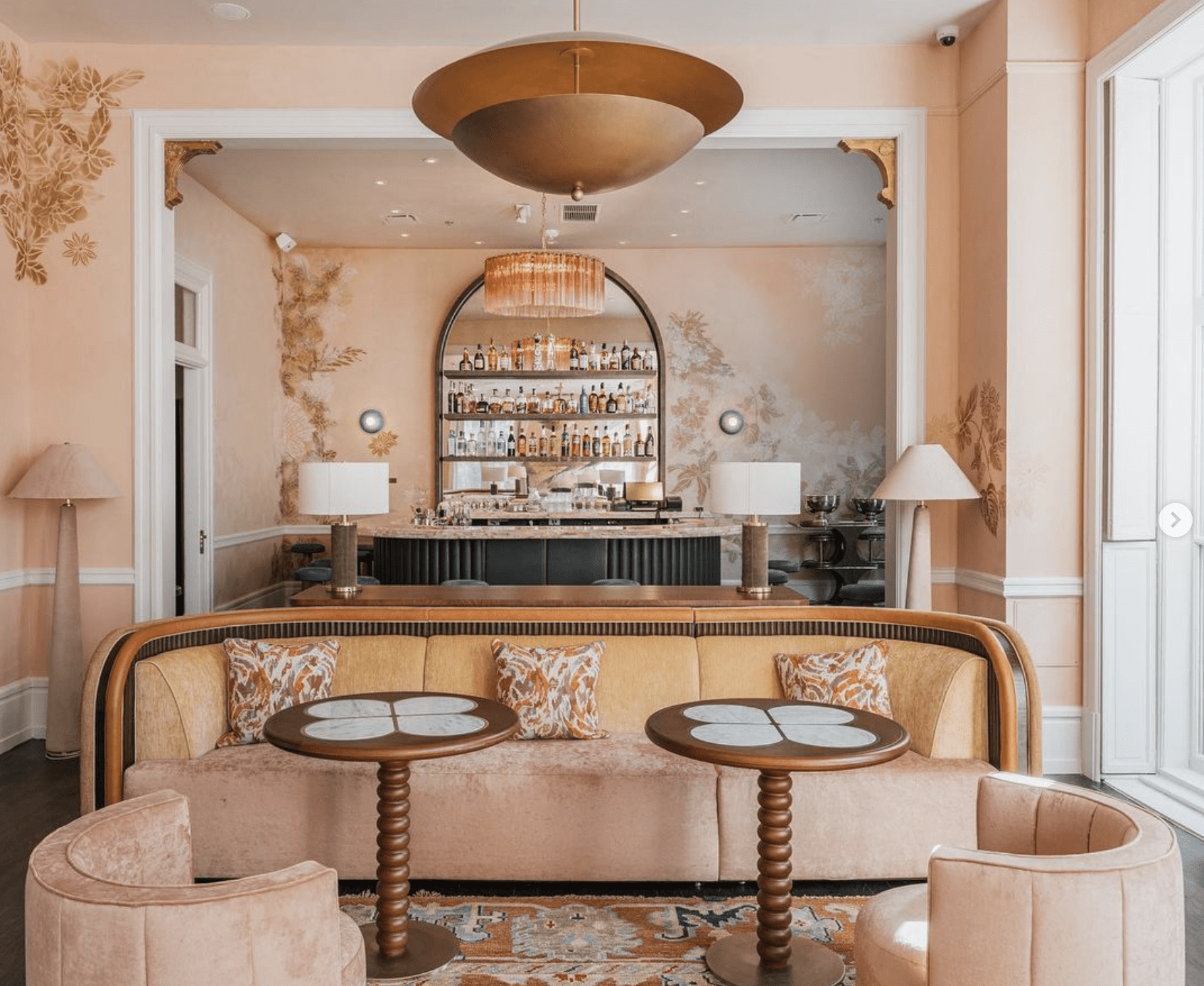
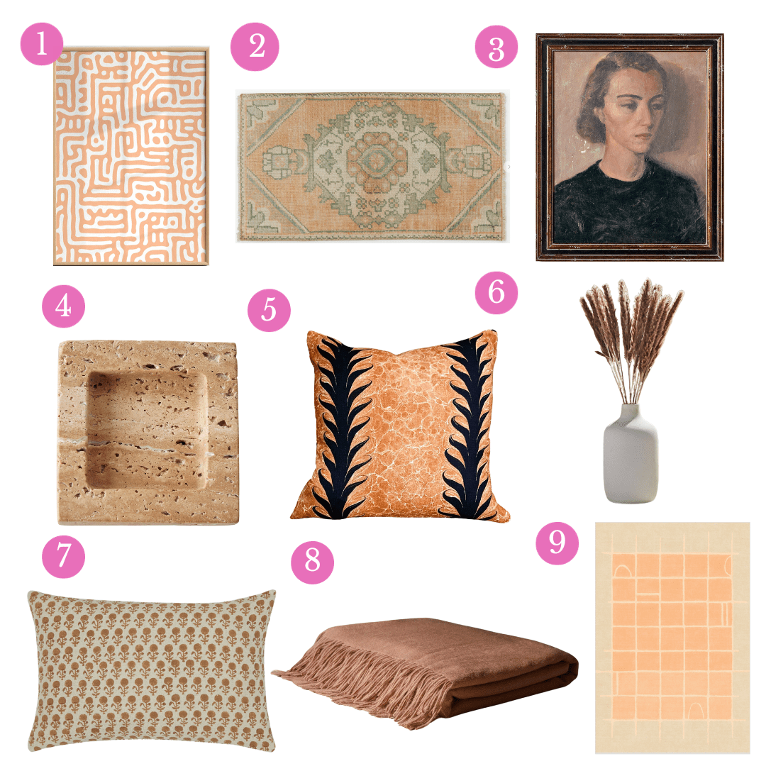
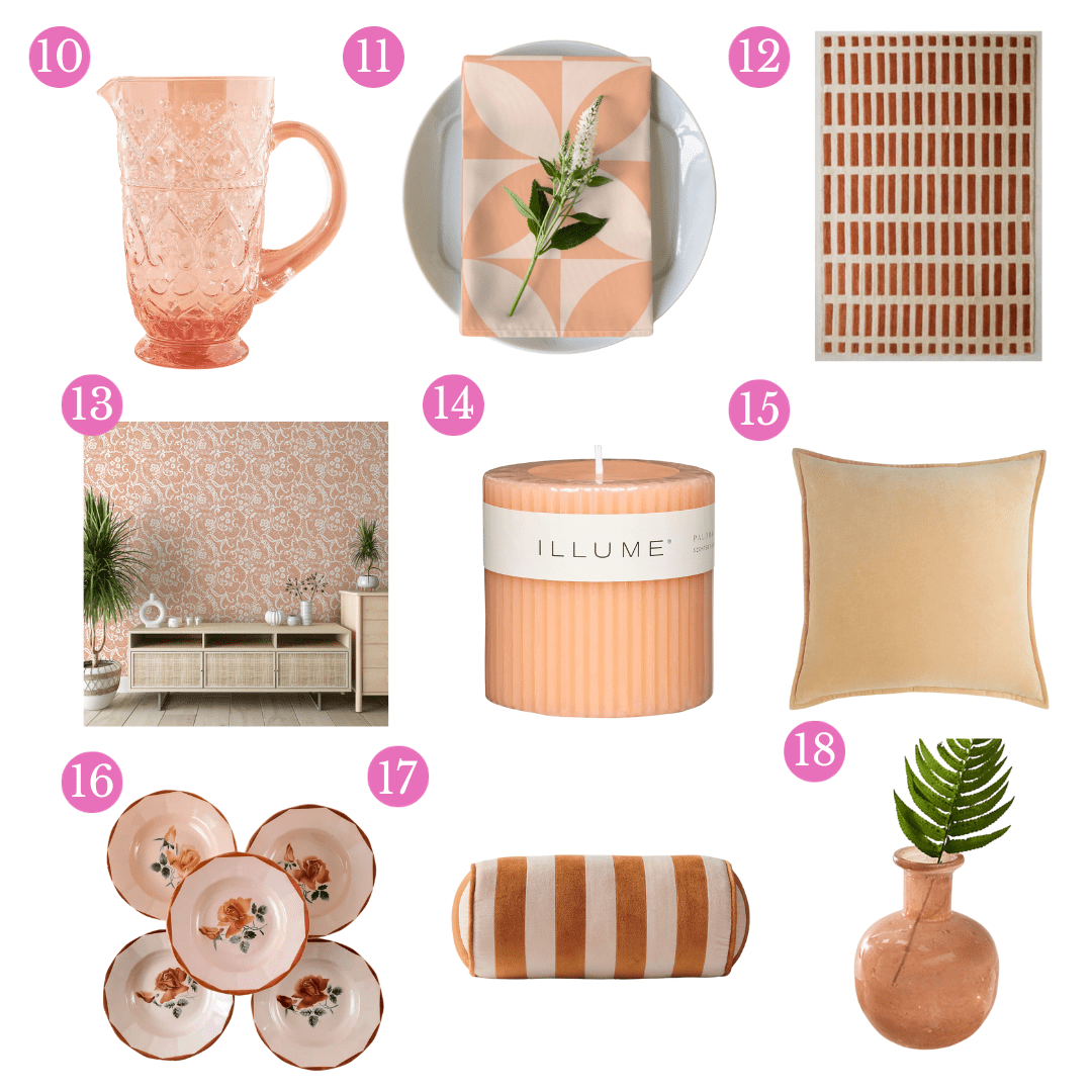
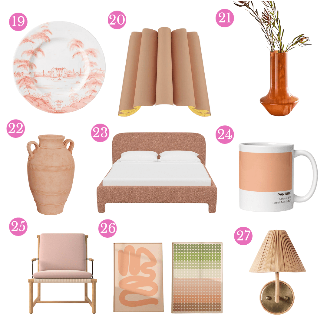
If you’re warming up to this rose-pink-meets-lightish-orange shade, but need some ideas before you bring it into your home, scoll down for some of our favorite finds….
And just for fun, make yourself a Peach Paloma and wait for the creativity to flow!
Peach Picks
Some of the above links are associated with affiliate sales 🙂

